Tuakiritaka | Our identity
The University is proud to launch its new brand on 1 May 2024.
This is the first significant change to the University’s visual identity in 155 years.
As well as connecting with a changing generation of students, we are proud the new visual identity will better reflect the University’s commitment to our Te Tiriti-led focus, which aligns with our strategy, Vision 2040.
The main changes include a new tohu (symbol) and ikoa Māori (Māori name), both created in collaboration with mana whenua.
Our tohu
The tohu (symbol) draws inspiration from Ōtākou channel, in Otago Harbour, which is a two-way channel that has always brought life to and from the region – just as the University brings and shares knowledge across Aotearoa New Zealand. It emphasises the importance of relationships, reciprocity and the transmission of knowledge between generations.

The new tohu (symbol) for the University of Otago.
Our tohu is used creatively, and with pride, both centre-stage and as a supporting design element. We can use it on publications, merchandise, stationery, in digital and print formats, in full and also cropped. However, there are some restrictions to how we can use it to follow proper tikaka Māori (Māori customs): namely, we do not place it where it is intended to be walked on or hit, on any items of food, or on clothing like undergarments or the sole of a sock.

Examples of the tohu in placements that are and are not acceptable.
Our te reo Māori name
Ōtākou Whakaihu Waka is the University of Otago’s te reo Māori name. It’s less of a literal translation than our previous Māori name, Te Whare Wānanga o Otāgo, but a metaphor meaning “a place of many firsts”. This refers to education and academic achievement, research and student experiences. It’s also a nod to our proud history of being the first university in New Zealand.
Whakaihu Waka is literally the “bow of the canoe” that pierces the ocean, leaving a wake for others to follow. It invites our students to be leaders in their chosen pathways.
Listen to the pronunciation of Ōtākou Whakaihu Waka:
Wordmarks and design elements
While the tohu is the heart of our new brand, it is called a wordmark when used alongside our name – in English or te reo Māori.
There are a variety of ways our new wordmark will be displayed, depending on the context it is displayed in.
Staff wishing to use the wordmark (logo) in University materials should download the appropriate file below:
Brand assets and templates
Horizontal wordmark
This horizontal English wordmark is the brand that will be used and seen most often.

Our primary, most hard-working wordmark.
Stacked wordmark
We use a stacked version of the wordmark for bold applications, and it is reserved for when our brand is the focus.

The stacked wordmark.
Te reo Māori wordmark
In contexts that promote te reo, kaupapa or tikaka Māori (Māori language, activity or customs) we versions of the wordmark that display our ikoa Māori (Māori name) more prominently.

Horizontal and stacked versions of our te reo Māori wordmarks.
Heritage design elements
Inspired by the University’s Coat of Arms, the new brand identity includes design elements that refer more directly to our heritage. These will most commonly be used in communications with our alumni and international audiences.

Heritage design elements.
International wordmark
To further help to establish our new tohu overseas, we include direct reference to New Zealand next to our primary wordmark.

The University of Otago wordmark in international contexts.
Sub-brands
Campuses, Divisions and Departments have official wordmarks which include their ikoa Māori and English names. These will most commonly be seen on stationery and official documentation, while our primary brand will be used more often in marketing and communications.
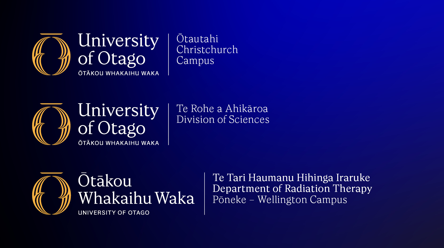
Examples of campus, divisional, and departmental sub-brands on English and te reo Māori wordmarks.
Co-branding
When displaying our brand next to another institution’s logo, clear space guidance of our logo and the partner or co-brand logo must be followed.
Minimum sizing and clear space
To uphold the mana of our new Māori name, and aid with its recognition, wherever possible we try to use the size of wordmark that allows both English and Māori names to be seen.
Regardless of size, the distance between the tohu and the rest of the wordmark (the x in the image below) dictates the minimum amount of clear space required around the wordmark.
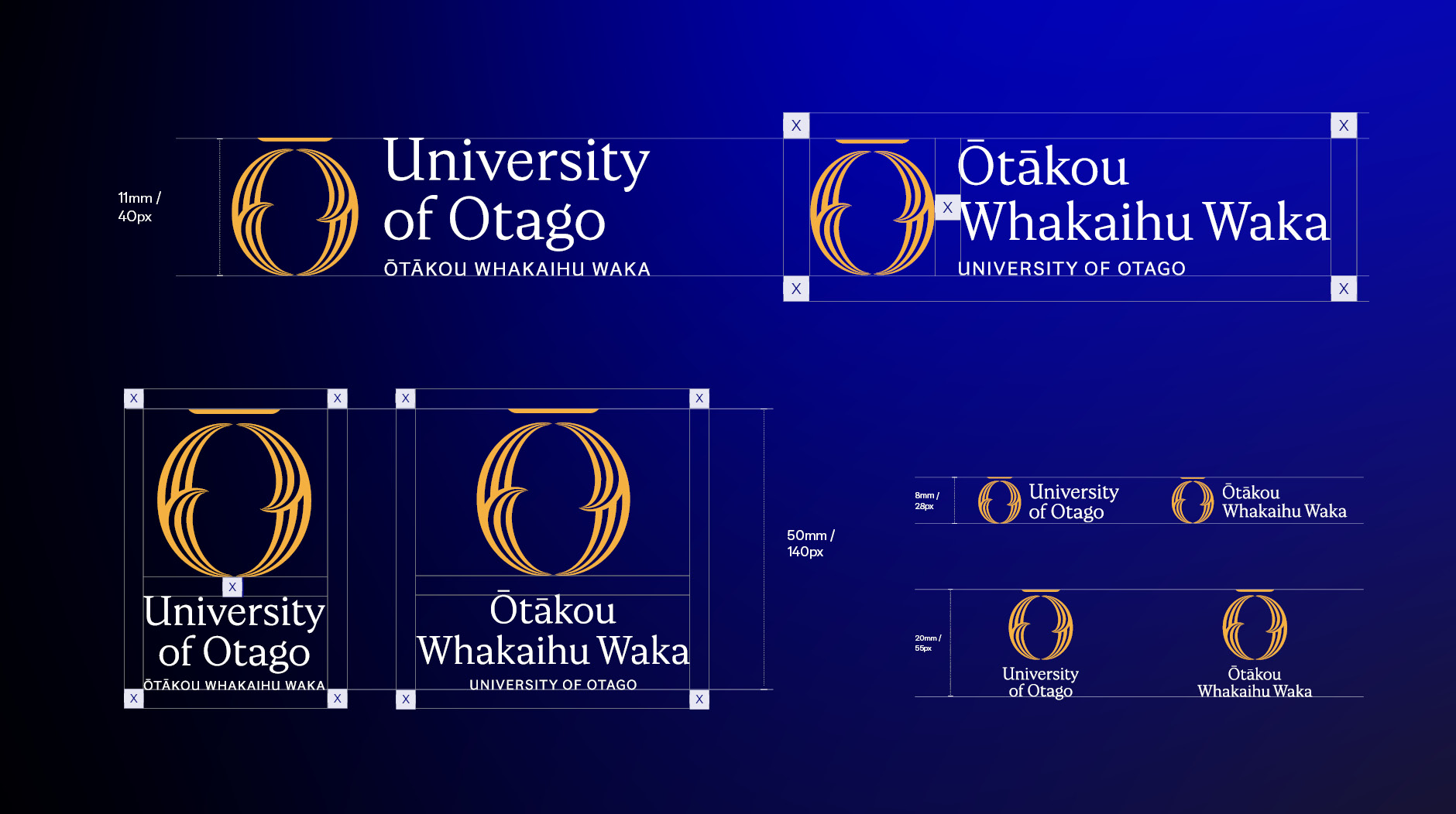
Our wordmarks should never be smaller than 11mm/40px high for horizontal, or 50mm/140px high for stacked. Applications smaller than this will include either, but not both, of our names.
See a larger version of this image
Choosing the right wordmark
The suite of wordmarks will be used in University communications and marketing in line with these brand guidelines.
If you are creating a branded asset, our multiple colour variations provide enough flexibility to ensure the wordmark has enough contrast. Instead of putting a box around a wordmark, choose a colourway that suits the image or background it is being placed on.

It’s important to consider contrast and composition when selecting the wordmark that’s right for you.
Kā tae | Colours
Our blue draws from our waterways and from the St Andrew’s Cross – bringing together our Māori and Scottish whakapapa and linking our past with our present and future. Our yellow is a reflection of the history of our place as a gold rush town and the prestige of our University.
Please note that the CMYK values (print) will not match the RGB values (digital) when viewed on screen. Always use the appropriate swatches for the relevant placement. Some Pantone colours have separate uncoated and coated (U and C) values in order to provide a more accurate match across different paper stocks.
Primary colours
St Andrew’s Blue – Ōrangitea
RGB: 6, 13, 135
HEX: #060d87
CMYK: 96, 91, 0, 6
PMS: 2738 U / 2746 C
Gold Rush – Rere Tārewa Kōura
RGB: 244, 177, 66
HEX: #f4b142
CMYK: 0, 29, 93, 0
PMS: 7406 U / 7408 C
Black – Pango
RGB: 0, 0, 0
HEX: #000000
CMYK: 0, 0, 0, 100
PMS: Process Black C
White – Mā
RGB: 255, 255, 255
HEX: #fFFFFF
CMYK: 0, 0, 0, 0
PMS: –

Our updated primary colours.
Accessibility
We must always ensure that our design assets are accessible to the widest range of people. Both White and Gold on St Andrew’s Blue, and St Andrew’s Blue on White and Gold, are WCAG 2.0 Level AAA compliant; any other combinations of our colour palette, or any other colours, should always be tested.
Secondary colours
Deep Blue – Pukepoto
RGB: 0, 0, 68
HEX: #000044
CMYK: 100, 95, 30, 55
PMS: 282 U / 4147 C
Deep Gold – Kōura-Uri
RGB: 238, 138, 7
HEX: #ee8a07
CMYK: 4, 55, 100, 0
PMS: 7413 C / U
True Blue – Kahurangi Tūturu
RGB: 49, 123, 255
HEX: #317bff
CMYK: 100, 70, 0, 0
PMS: 2171 U / 2382 C
True Yellow – Kōwhai Tūturu
RGB: 255, 222, 70
HEX: #ffde46
CMYK: 0, 10, 90, 0
PMS: 115 U / 116 C
Sky – Kikorangi
RGB: 218, 235, 252
HEX: #daebfc
CMYK: 12, 2, 0, 0
PMS: 9400 U / 9401 C
Ivory – Rei
RGB: 251, 249, 237
HEX: #fbf9ed
CMYK: 1, 1, 7, 0
PMS: 9345 U / C
Digital Blue (Digital Only) – Kahurangi Matihiko
RGB: 0, 0, 255
HEX: #0000ff
Digital Yellow (Digital Only) – Kōwhai Matihiko
RGB: 255, 255, 0
HEX: #ffff00

Our secondary colours.
Note on te reo Māori: Ōrangitea and Rei are names specific to the colours above, and not generic terms for use elsewhere.
Gradients
Our blue and gold are also available as gradients, which will be used to add vibrancy to our graphic design. These files are set up and templated so they are consistent, and will be used centrally to ensure this is maintained.

Moana and Kōura, our blue and gold gradients.

A variety of colour and gradient combinations featuring our tohu.
Typeface
Wickliffe Serif is our primary brand typeface. It is most commonly used across headlines and larger settings, supported by Wickliffe Sans Serif in body copy. These typefaces should be used in the majority of circumstances, and as a bespoke typeface it has been exclusively licensed and is available for all staff to use.
It is named after the first ship carrying Scottish settlers to the region, the John Wickliffe. This ship carried Charles Henry Kettle, whose annotations on the first extensive surveying draft of the Dunedin area were used as inspiration for the form of our serif font.

The serif and sans serif fonts available in our Wickliffe typeface.
Image description
See a larger version of this image
In certain circumstances, where a Windows system font must absolutely be used, Georgia and Arial can be substituted for Wickliffe and Wickliffe Sans respectively.
Imagery
There are three principles which guide our capturing and selection of imagery.
1. Māui Pōtiki – spirited, engaging and inspiring
Evoke boldness, innovation and curiosity. Use creative ways to mirror our university’s world-leading research and teaching. While staying humble, showcase individuals and achievements with confidence and pride.
In practice:
- Focus on the human emotion at the heart of our community’s biggest moments – whether at a convocation, graduation, at an IPL or in the lab.
- Include striking contrasts and vibrant colours – bonus if Gold Rush or St Andrew’s Blue – when showcasing the natural environments of campuses and surroundings.
- Show preference to new, novel or otherwise interesting places to show off the learning environment at Otago.
2. Kākau Marae – genuine, warm, and human
Authentically represent our unique place in the South Pacific, and the diversity of our university community – now and into the future. While avoiding stereotyping and tokenism, we celebrate people of different backgrounds, cultures, abilities, identities and perspectives.
In practice:
- Avoid overly staged images: we want to showcase our students, teachers and researchers with approachable expressions – not applying for a passport.
- Photos that aren’t of a named subject (portraiture or features) should include a diverse range of people.
- Capture our unparalleled student experience rather than creating it. If possible, the subjects of images should be friends, flat mates, or have sat next to each other in more than a couple lectures.
3. Tūturu – authentic, confident and straight-up
Images support your message, and – very importantly – make sense next to your carefully chosen words. We need to be engaging, and happy to represent the best bits of our university, but not in a way that over-sells or misleads.
In practice:
- We use imagery that focuses on real people – our people – doing things that make sense to them.
- Whether in a lab, lecture, or on the harbour, we show people safely or accurately operating like they should. Following the guidance of subject matter experts is key here.
- Keep tikaka Māori (Māori customs) front of mind. Seek guidance before featuring images of our tauira me ngā kaimahi Māori (Māori students and staff). We avoid cropping or covering someone’s face or head, and photos shouldn’t show someone sitting on pillows or hats on tables. Photos taken on marae or featuring whakairo (carving) should be used purposefully, only when relevant, and only with relevant permission.
Choosing imagery
When choosing existing imagery:
Consider who is seeing the image (your intended audience) and where the image will be used (the platform, or channel).
Use images that look natural. That means natural lighting, relaxed subjects, sensible settings and no obvious editing. There’s beauty in imperfection.
Feature people as the subject of the image wherever possible, and make sure they’re doing something that makes sense to them: fluid motions and feasible activities.
Talking about ourselves
The University of Otago remains our official name. When writing out both of our English name and ikoa Māori together, it can either be written as University of Otago – Ōtākou Whakaihu Waka, or Ōtākou Whakaihu Waka – University of Otago, depending on the context in which it’s being used. Our main social media channels will have our English name first to build association with our new tohu within limited space, but longer form writing may follow the language approach of the rest of the document or article.
Unlike our former te reo Māori name (Te Whare Wānanga o Otāgo), it does not make sense to add a modifier, like ‘ki Ōtautahi’, to indicate location. Our campuses will now be referred to as University of Otago, Location – for example, University of Otago, Wellington – Ōtākou Whakaihu Waka, Pōneke.
Brand assets and templates
Included below are a variety of assets that feature our new brand, available for use in your day-to-day work.
Font files (requires University staff login)
Wordmark (logo) files (requires University staff login)
PowerPoint templates (requires University staff login)
Digital letterhead templates and other stationery (requires University staff login)
Desktop wallpapers and screensavers (requires University staff login)
Video conferencing backgrounds (requires University staff login)
Generating an email signature
You can use the email signature generator at the Uniprint online ordering website to create your new University of Otago signature.
Ordering stationery
The below range of stationery is available to purchase from Uniprint:
- A4 presentation folder
- Business cards
- Compliment slips
- Envelopes
- Letterheads
To order, visit the Uniprint online ordering website and complete the Online Order Form – Printed Stationery.
You need to be registered with Uniprint to use this form. Contact Uniprint Client Services to register.
If you would like branded stationery created that is not on the list above, please contact:
Email design.services@otago.ac.nz
Questions?
If you have any questions about the application of the brand, please email the Tuakiritaka project team.
Email tuakiritaka@otago.ac.nz
If there are any questions regarding technology not specific to the brand, please visit the AskOtago Service Portal.